
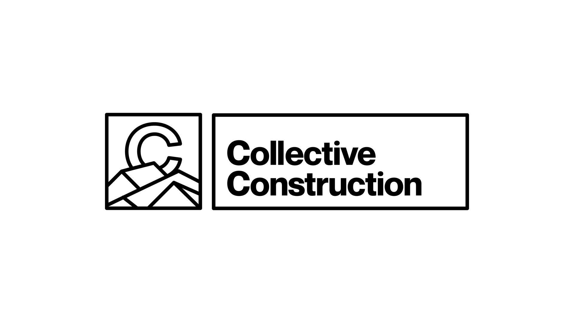
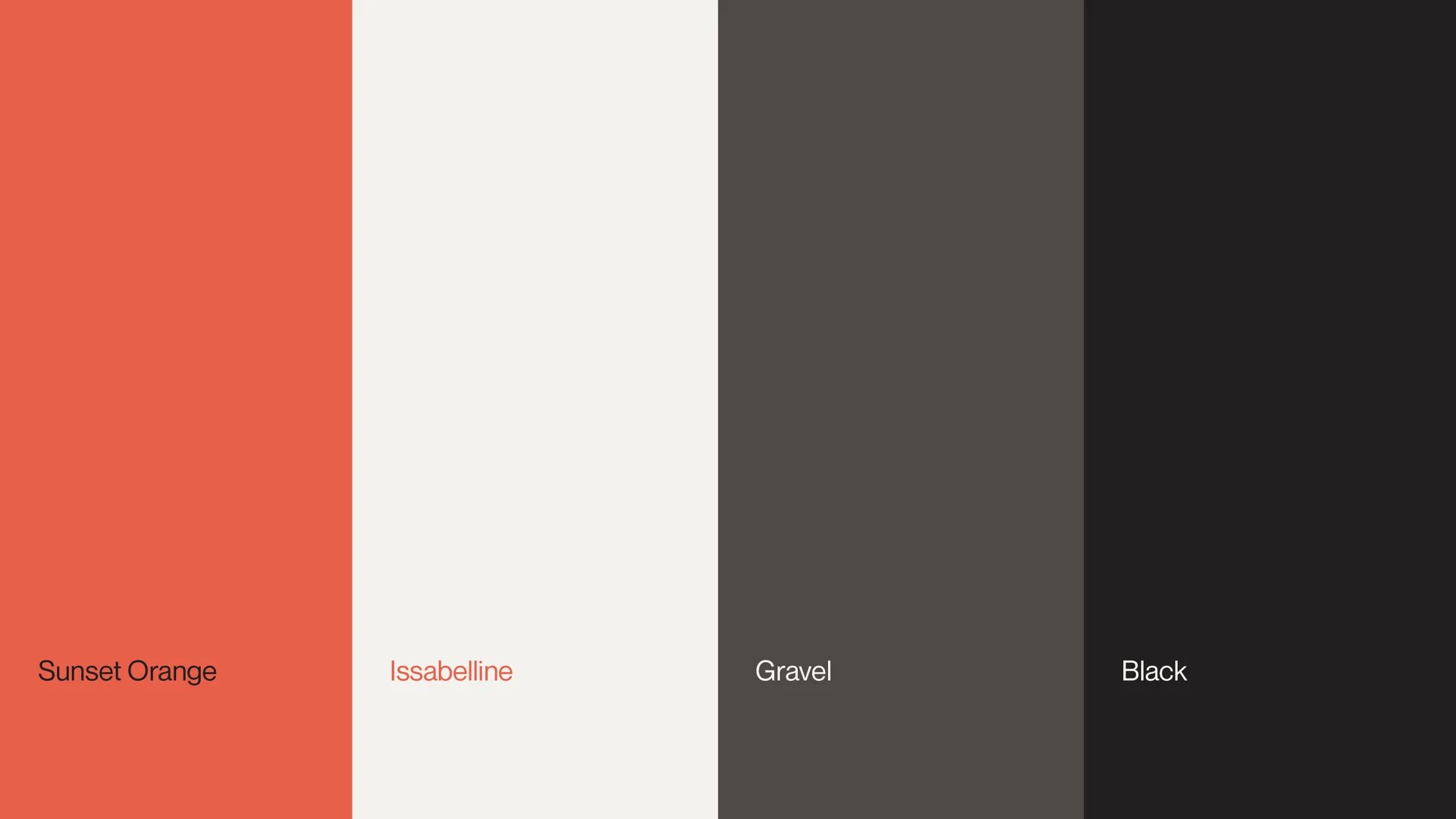
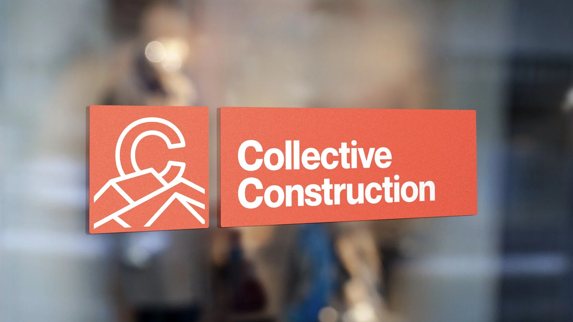
Collective Construction Logo Design
When Collective Construction approached us, they needed a brand that could flex across a wide variety of property and land development projects—everything from residential builds to large-scale commercial work. The challenge: create a visual identity that feels both trustworthy and adaptable, with enough character to look sharp on a truck, a hat, or a job site sign.
We started by focusing on what sets Collective apart—their team. This is a crew that takes pride in their work and wears that pride literally. Every hat, shirt, and hard hat represents the brand they’re building together. That level of ownership became our north star: the logo and system needed to feel like something you’d want to wear, not just sign.
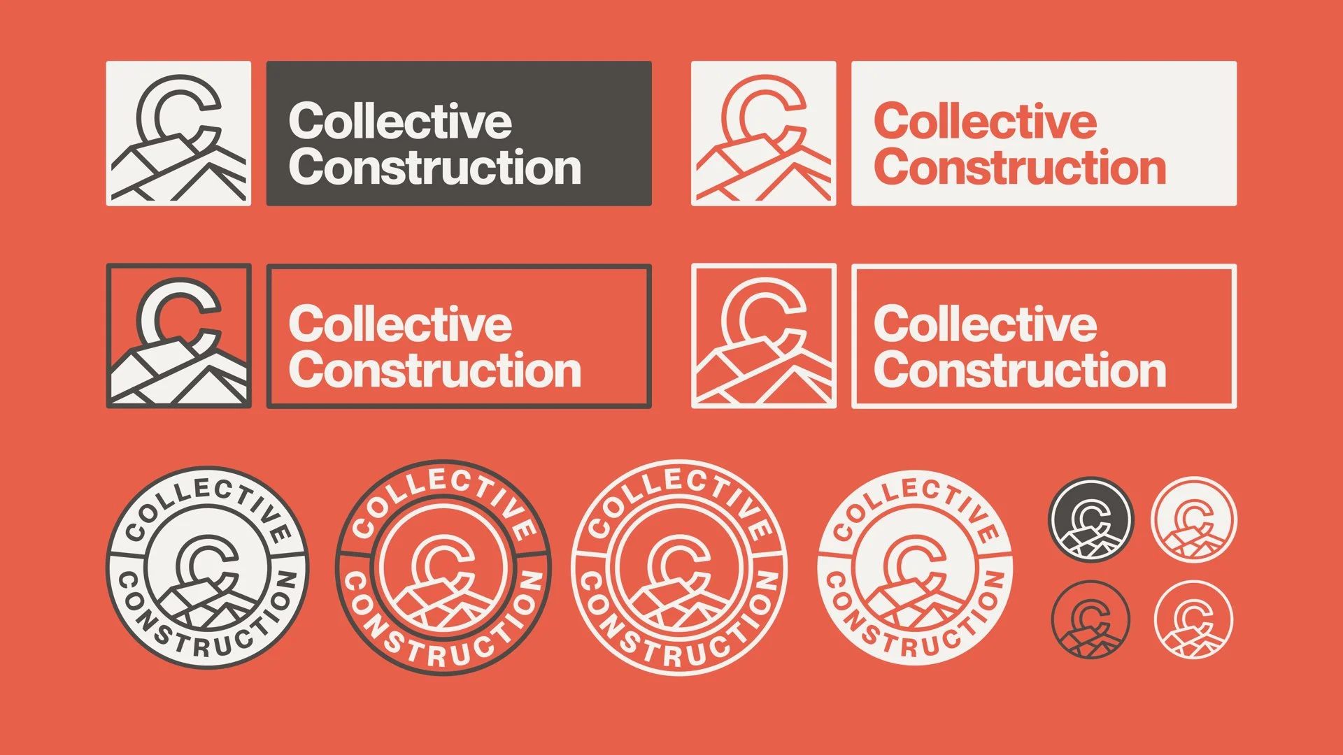
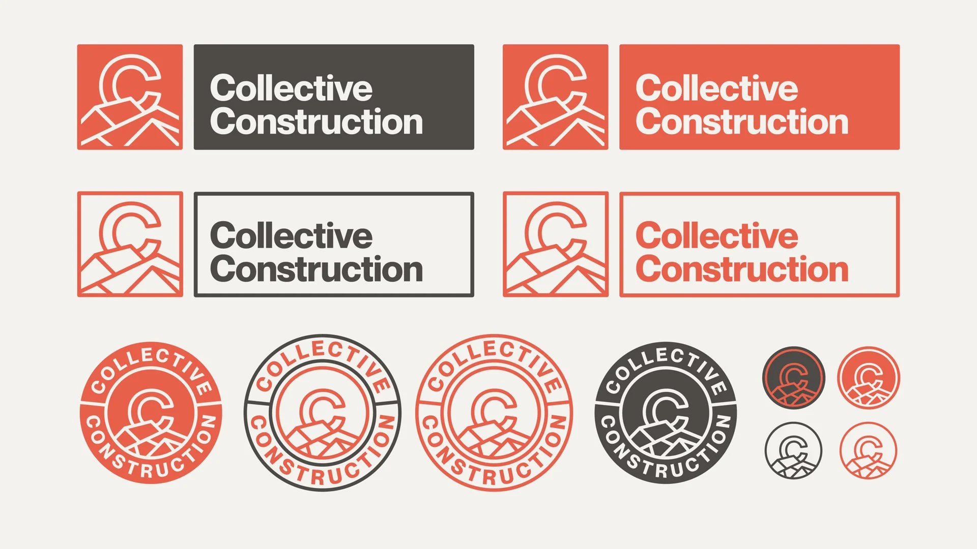
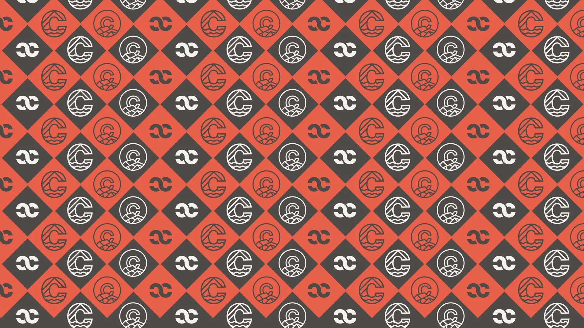
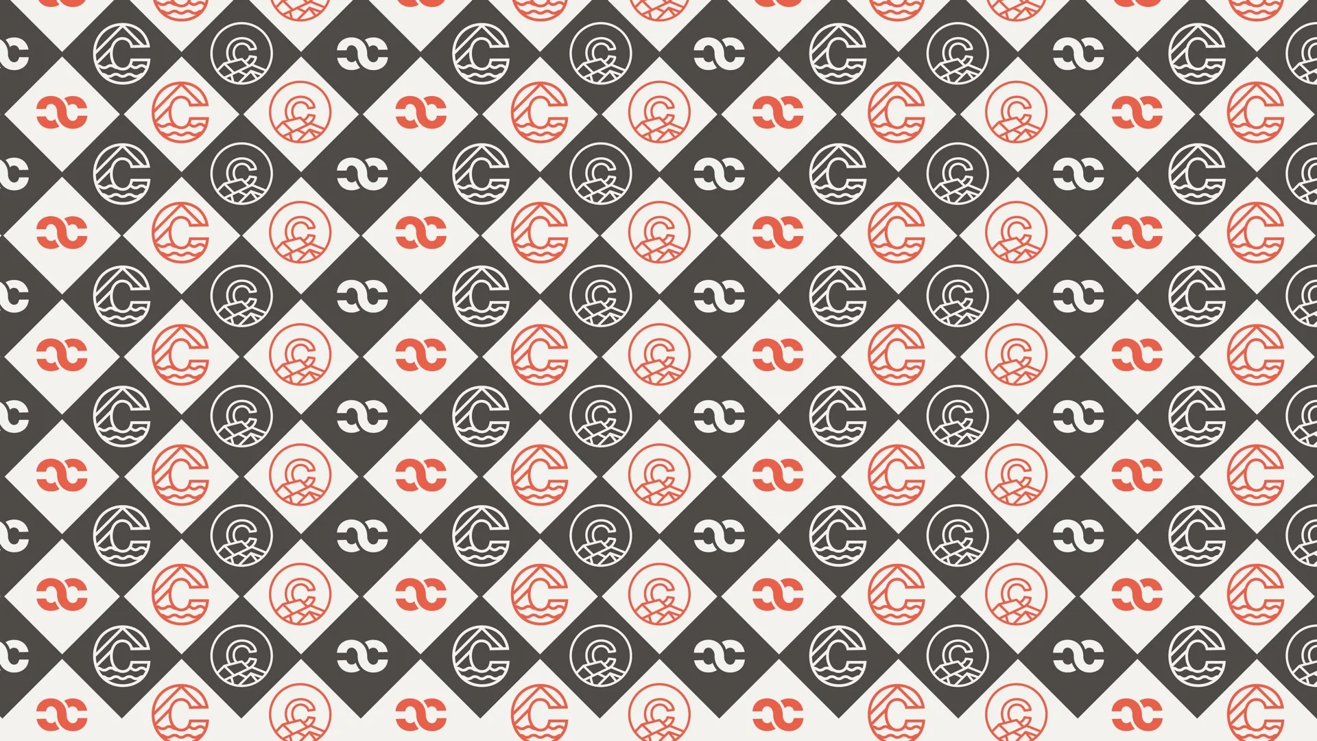
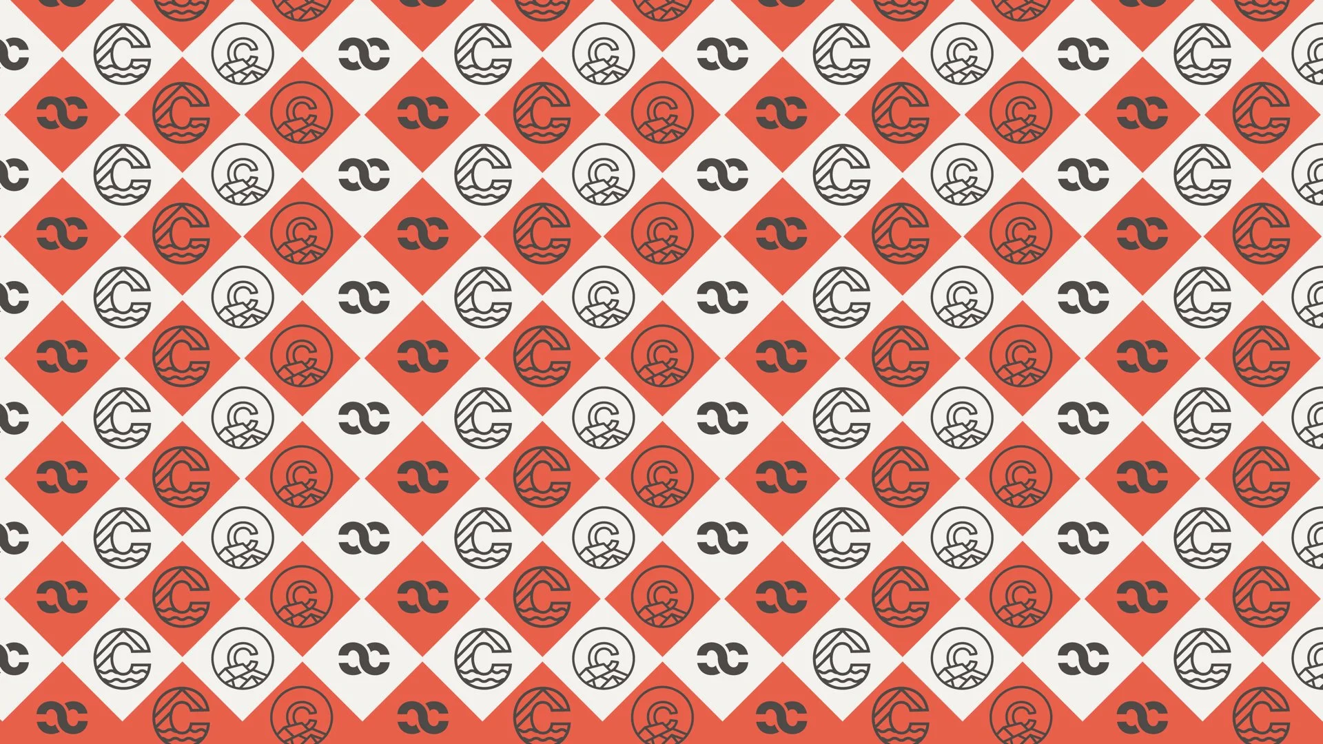

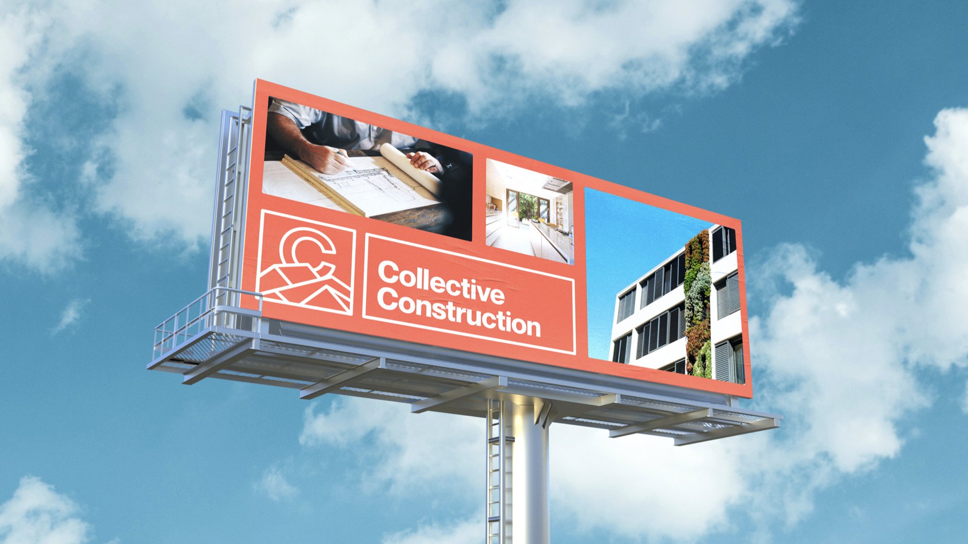
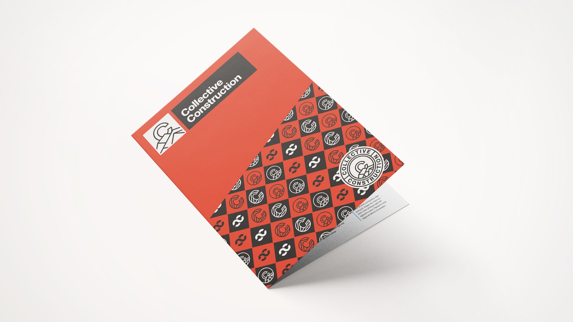
The final mark is strong and straightforward, echoing the confidence you want from the people building your future space. To expand the system, we developed a repeating texture made from the logo’s elements—a subtle pattern that adds depth and sophistication without overpowering other visuals. It’s a flexible layer that works across digital and print, signage and gear, tying the brand together wherever it shows up.
From typography to tone, the entire identity leans into clarity and competence. It’s clean without feeling cold, and it speaks the same language as the people behind it—steady, skilled, and grounded.
Collective Construction’s new brand is more than a visual upgrade. It’s a symbol of craftsmanship and pride that their team is proud to represent every day—on the job site and beyond.